Friday, December 18, 2009

Freedom from Want--Thanksgiving Hook (High School Art Criticism Mini-Lesson)


Just before the Thanksgiving Holiday, I used these images of "Freedom from Want" by Norman Rockwell as prompts for an art criticism mini-lesson. I simply projected them, provided the following information for note-taking and asked students to work individually or in small groups to answer two questions before we discussed them as a class. I found it to be a simple, quick and effective art criticism "hook," and hope you do too.

Background Information:

Norman Percevel Rockwell (February 3, 1894 – November 8, 1978) was a 20th century American painter and illustrator. His works enjoy a broad popular appeal in the United States, where Rockwell is most famous for the cover illustrations of everyday life scenarios he created for The Saturday Evening Post magazine over more than four decades.

His last painting for the Post was published in 1963, marking the end of a publishing relationship that had included 322 cover paintings. He spent the next 10 years painting for Look magazine, where his work depicted his interests in civil rights, poverty and space exploration.
Many contemporary artists consider his work trite or banal and refer to him as an "illustrator" rather than an "artist" or "painter," as an insult. However, Rockwell referred to himself as an illustrator.

Normal Rockwell created images illustrating The Four Freedoms first published in The Saturday Evening Post. The Office of War Information later issued the series as posters as an incentive for War bond purchasers. Many of these posters are still sold today.

The Four Freedoms are goals famously articulated by United States President Franklin D. Roosevelt, urged by wife Eleanor Roosevelt and friend Jon Run, on January 6, 1941. In an address also known as the Four Freedoms speech, FDR proposed four points as fundamental freedoms humans "everywhere in the world" ought to enjoy:

1. Freedom of speech and expression
2. Freedom of religion
3. Freedom from want
4. Freedom from fear
Source: Wikipedia

Questions:
1) What are all the ways in which Rockwell communicated the concept of "Freedom from Want" in this image?
Make sure students notice details about the room (sparkling appearance, wall paper, artwork, etc.), as well as light quality, the fresh-scrubbed appearance of the family members along with their clothing and their expressions, grand parents presiding, the china/crystal, the crudite, etc. They should also notice that the table isn't laden with food, yet the turkey is enormous.

2) What pictorial strategies did Rockwell use to make us feel like we are a guest who has just walked in to join the feast?
Students should notice that the way the table is cropped makes it appear to extend into our space and that the way the male in the bottom right corner is turned to look makes it seem as though he heard us walk in and has turned to welcome us.

Wednesday, December 16, 2009

It Ain't Heavy, It's My Baggage (High School Art Unit Plan)


The Art Problem:

This Creative Challenge invites students to express something about their personal "emotional baggage" in a poetic and somewhat ambiguous way using drawings of common objects on top of prepared grounds. Photocopies of luggage drawings (whole pieces and details) are submerged in grounds prepared with newsprint and ink washes. On top, students draw and paint objects that, in themselves and through their relationships with each other, symbolize what lies at the crux of each student's "emotional baggage."

Materials:
A variety of suitcases (I borrowed them from our choral director's props storage)Sketchbook or sketch paperPencilEraserPaper (we used a tall vertical—or horizontal—stony medium gray paper)
Tape (to tape margins of paper)
Newsprint
Matte medium or ever-so-slightly watered down glue
Black India ink (diluted)
Symbolic objects (brought from home or pilfered from still-life storeage)
White acrylic paint
Brushes, water, containers
Ebony pencils
After first day of Challenge, you will need photocopies of students’ drawings of suitcases (whole pieces and details; I asked them to choose their best two and I made small, medium and large copies of each). Note: If you prefer to save time and paper, students can use their actual drawings, but copies in different sizes are nice for unity.
Embroidery floss in a variety of colors (I bought a couple of inexpensive variety packs)Embroidery Needles

Prerequisites: An understanding of and sketchbook practice with modeling techniques (hatching, cross-hatching, stippling, cross-contour marks, etc.)
Familiarity with "weighted line" (widened and tapered line) and varied line quality
Knowledge of a value scale
Basic understanding of composition and Elements and Principles of Design

Individual Student Procedures:
Class 1
1. Discuss definition of "emotional baggage"— ideas, beliefs, or practices retained from one’s
previous life experiences, especially insofar as they affect a new situation in which they may be no longer relevant or appropriate.
2. Students to write an entry in their sketchbooks about their personal emotional baggage. (If you want to give them the option of keeping it private, have them tape a "cover sheet" over it.) 3. Students make a series of approximately six 5-minute gesture drawings of whole suitcases or details, aka "the baggage," at a series of drawing stations—suitcases set on tables with a few chairs gathered around. (We used white drawing paper and thick graphite sticks, but you could use whatever you prefer.)
4. Students choose their favorite two drawings for teacher to photocopy, if using photocopies.
5. Homework: students bring objects from home to symbolize their emotional baggage (or they can scavenge them from still-life storage).

Class 2: Prepared Grounds
1. Students tape edges of their paper (they should stick masking tape on their clothes to remove a little of the adhesive and then lay along edges of paper).
2. Using matte medium or glue with a drop or two of water, students adhere 3 pieces of newsprint to their paper support, by brushing under and on top of newsprint. Small sponge brushes work well.
3. Next, students wash over their ground with a medium ink wash.
4. Then, students cut out their suitcase drawings and, using matte medium or very slightly diluted glue, adhere them in an interesting way to their support to create movement, repetition, unity and variety.
5. While grounds are drying, students should being work on their thumbnail sketches. The tricky part is helping students draw a thumbnail in which they indicated the lines and shapes established in their prepared grounds.
6. If desired, students can practice modeling the objects they have chosen.

Class 3 and 4 (maybe more): Developing Compositions
1. To begin building up drawings on their grounds, students may block out areas with black ink to create separation between object and ground and, once dry, work on top. Or, they may work directly on the ground and add later add a black ink halo for separation.
2. In either case, to create objects, students lightly sketch the contours first in whatever media will show up and then paint the silhouettes solid white. Once dry, students use Ebony pencil to model the form of the objects, striving for drama through a wide range of values.
Class 5 and 6 (maybe more): Color 1. Students choose complementary colors of acrylic and dry brush them on to create additional layers of movement, unity, variety and emphasis.
2. As a finishing touch, students use embroidery thread in one or both colors—or even twist them together—and stitch into their pieces using restraint to develop the movement, unity, variety and emphasis even further. (They can use any type of stitching they choose, though mimicking that of the luggage can be effective and is, in fact, what inspired the use of thread.)
3. Finally, students may work back into compositions, if desired, to make any adjustments using any of the materials used so far plus, e.g. white and colored pencils.

Student Extension—Group Critique:
Prior to the critique, students put their names in a box and then draw a name other than their own. Then they fill out a Critique Form based on the work created by the student whose name they drew. They will refer to this form during the Critique. (This ensures that the critique moves along with no one grasping for something to say.) Next, students and teacher sit in a circle for the Critique during which each student, in turn, addresses at least 3 aspects of the work s/he critiqued, preferably a balance between "glows" (strengths) and "grows" (areas of improvement). After each student presents, the student whose work was critiqued is given an opportunity to address aspects of his or her work. Similarly, other students may comment.

Assessment:
Score and comment on pieces according to the "Sailing the 7 Cs" visual arts rubric

IB-MYP Area of Interaction: Health and Social
Image Credits (top to bottom): Stephanie B., Paula L., Grace M., Maggie Q., Annaelle S., Kendria T., and Teacher Sample, Betsy DiJulio, NBC Art Teacher, Princess Anne High School, Virginia Beach, VA.

Thursday, December 10, 2009

Inside Out (High School Art Unit Plan)


Above are ten student samples followed by two inspiration images and then by my "teacher sample" for this Creative Challenge. Please stay tuned for the complete plan in the near future.

In the three sections of my beginning studio course, we had been modeling white vessels as our first painting exercise. However, I had been struggling to decide exactly what I wanted to do that would make use of those technical skills while still challenging students on a conceptual level. Because of the latter, a monochromatic still life was out, and I rejected another one or two of my rather lame ideas as well.

Searching "white vessels" in Google "images," I found the first two artworks above. They percolated for a while and, then, something clicked in my mind. I decided to merge them so that a modeled white vessel (with shadow) would become a metaphor for our exterior and interior selves, a fabric pattern would represent the image we project, and a silhouetted object or animal the more "hidden" part of ourselves. Collaged newspaper would add another layer of texture, contrast and interest.

In my sample, I painted a piece from my collection of McCoy Floraline matte white ceramics juxtaposed against a retro pattern representing how I am seen by others, and a hummingbird silhouette symbolizing what I know about myself. The newspaper is collaged in a way that helps define the table and the wall, and I added contour-silhouette drawings of the hummingbird to create more unity and movement.

I look forward to sharing the whole enchilada with you soon.

Student Samples: (top 10 images): Beth C., Sam L., Kallie H., Julie K., Demetria W., Gilbert L., Nicole V., Audrey D., Brianna K., Nahlyanne B; Inspirational Image Credits: (second and third from bottom) "Blur Bird," by Clair Bremner and "Untitled" from The Painted Pear (I could not find an artist's name); Teacher Sample Credit: Betsy DiJulio, NBC Art Teacher, Princess Anne High School, VA Beach, VA

Sit Down and Speak Up! (High School Art Unit Plan)


The Art Problem:
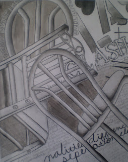
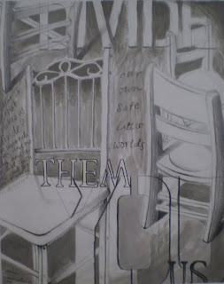
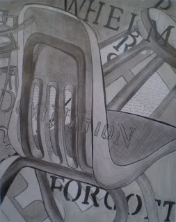
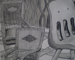
This Creative Challenge is a spin on the negative command "Sit down and shut up." It invites students to "speak up" in relation to an issue about which they feel strongly. The vehicle for communication is a metaphorical drawing that makes use of chairs drawn realistically from observation, as well as both handwritten and stenciled text. Irrespective of the words, the style, size and placement of the chairs should communicate the student’s issue. The text should embellish, enhance and reinforce. It should NOT look like a label on a poster!

Materials:
A variety of chairs [we used a white wicker rocker, a child’s white wooden rocker, school chairs, a plastic folding chair, three different "bistro" chairs (1 all wood and 2 that were metal with upholstered seats, one with an angular back and the other with a curved back), and a couple of stools]
Sketchbook or sketch paper
Pencil
Eraser
Optional: Viewfinder
Pencil value scale
White tag board (we like to use 14 x 17" with a 1" taped border all the way around)
Ebony pencils
Stencils in a variety of fonts and sizes
Several values of "Dirty Water Wash" (a very small amount of black and brown, even a little blue, mixed with a large quantity of water to make a cool or slightly warm gray wash)
Brushes

Prerequisites:
An understanding of and sketchbook practice with modeling techniques (hatching, cross-hatching, stippling, cross-contour marks, etc.)

Familiarity with "weighted line" (widened and tapered line) and varied line quality

Knowledge of a value scale

Basic understanding of composition and Elements and Principles of Design

Individual Student Procedures:
1. Choose an issue to communicate (not just a concept, but a compelling issue about which you feel some degree of passion).
2. Choose the style(s) of chair(s) that would best express your issue.
3. Decide on the number, size and position of chairs to further communicate aspects of your issue. 4. Draw one or more thumbnails in sketchbook (use a 4 x 5" template for a 12 x 15" drawing); discuss with teacher; chose one, revise if necessary. Note: it can be difficult to incorporate text into a small thumbnail, so encourage students to just "block out" where text and washes will go. OR, if you are willing to expend the resources, when students are finished drawing their chairs on their actual artwork, photograph, print, and have them use the printout as a larger "thumbnail," so they can work out placement of the handwriting and stenciled letters. IMPORTANT: text should embellish, enhance and reinforce, NOT detract from drawings of chairs. 5. Stick tape onto clothes to remove some adhesive and then stick onto borders of 14 x 17" tag board to create a 12 x 15" drawing area. 6. Transfer thumbnail to tag board 7. Model chairs making sure to include a full range of values from light to dark. Set aside.
8. Write a journal entry about your issue. Choose whole passages, sentences and individual words to incorporate into your composition. Consider some of the innovative strategies from your text composition in sketchbook (see "Hooks and Mini-Lessons" below).
9. Add text to drawing. Note: a few considerations in regard to text: students think that less text detracts less from their chair drawings but, sometimes, the use of, e.g. one word makes that word a focal point and results in greater distraction. Sometimes whole passages written almost as a background texture throughout larger areas of the composition is less distracting, but adds visual interest and meaning. Also, if text is too prominent, washing over it can blend it into the background. Cropping passages and words adds a sense of "poetry" and mystery to the works so that the message isn’t so obvious and the viewer is encouraged to interpret.
10. Add washes to drawing, keeping in mind that the most successful: a) may not include washes in all of the negative spaces—leave white paper in some areas; b) may incorporate different values of washes; and c) may incorporate washes that transition for light to dark. Note: In general, dark washes should be placed behind light objects and light washes behind darker objects. 11. Adjust values if necessary. Pencil marks may be used over washes to deepen the value if students feel unsure about adding darker washes. Also, if students have inadvertently allowed white areas to "disappear," they may use white acrylic paint or white china marker to add white back into the composition. If students are inexperienced painters, a dry brush technique may be the most successful.
12. Optional: At one or more points during the process, conduct a simple ("2 Glows and a Grow") in-process critique: give all students a 3 x 5" card and a pencil or pen; have students leave their artwork at their desks and begin to walk around the room while you play music; when you turn the music off, they sit at the closest desk; there they write at least 2 detailed "Glows" (aspects of the artwork that the student is handling really well) and at least 1 detailed "Grow" (an aspect of the artwork that needs improvement) and sign their card; everyone moves back to their original seat and reads their classmate’s remarks before gluing the card into their sketchbooks.

Hooks and Mini-Lessons:
[Incorporate one per class prior to completing other drawing and composition practices in preparation for the "Sit Down and Speak Up!" Creative Challenge; some could be used as hooks or warm-ups on the day(s) that students work on thumbnail sketches.]

Innovation Stations: In small groups, students use photocopies (small, medium and large) of chairs, similar to the ones chosen for this assignment, to arrange on black paper in the center of their table to communicate the concept of their choice; groups whisper concepts to teacher who writes them all on the board; whole class tries to match each concept with the corresponding composition (correct matches are not the main goal; reasonable justification for their selection is)

Show one of the "Flexible Love Chair" videos on YouTube (always preview first) and ask students to create a journal entry in which they sketch the chair and brainstorm in small groups what properties of the chair are being demonstrated (e.g. flexibility, durability, adaptability, portability, etc.). Note: in the videos we watched that I had previewed, there was nothing "love"-related or inappropriate. We are not sure why it is called a "love" chair, except that you and your students will "love" it.

Notes and practice with Art Criticism (describe, analyze, interpret, evaluate) as applied to the following (at the beginning of three separate classes):
o Doris Salcedo, "Untitled," (1,600 chairs) Istanbul Biennial, 2003
o Marc Andre Robinson, "Myth Monolith: Liberation Movement"
o John Cederquest, "Conservation Chair" compared with Gruba Design Studio, (Untitled Chair)

Fold a paper beach chair from Youtube.com video instructions (use "pause" and "play" buttons as needed; draw a lifesize study of it in sketchbook. Note: beware ads that are added to some of youtube's videos.

Draw a study of a chair in sketchbook.

Create a composition on one whole page of sketchbook using only stenciled letters and handwritten text. Incorporate what one knows about composition and Elements and Principles of design (e.g. creating a focal point and secondary focal points, cropping for more interesting negative space, etc.) Emphasize that handwritten letters are lines and stenciled letters are shapes like any other. Encourage innovation, experimentation and risk-taking.

Student Extension—Group Critique:
Prior to the critique, students put their names in a box and then draw a name other than their own. Then they fill out a Critique Form based on the work created by the student whose name they drew. They will refer to this form during the Critique. (This ensures that the critique moves along with no one grasping for something to say.) Next, students and teacher sit in a circle for the Critique during which each student, in turn, addresses at least 3 aspects of the work s/he critiqued, preferably a balance between "glows" (strengths) and "grows" (areas of improvement). After each student presents, the student whose work was critiqued is given an opportunity to address aspects of his or her work. Similarly, other students may comment.

Assessment:
Score and comment on pieces according to the "Sailing the 7 Cs" visual arts rubric

IB-MYP Area of Interaction: Health and Social

Teacher Sample Credit: (top) Betsy DiJulio, NBC Art Teacher, Princess Anne High School, VA Beach, VA; Student Sample Credits (top to bottom under teacher sample): Kameshia P., Samantha M., Bethany C., Sofia A.

Tuesday, December 8, 2009

Magic Mystery Prompts (High School Art Unit Plan)


My intermediate, advanced and AP students, though initially unsure of what I was getting them into, absolutely loved this process and the results. I hope yours will too. It is a great challenge to use between those requiring extended periods of intense focus.

The Art Problem:
Students will create a work art using a series of prompts that create intentional and accidental mark-making. Students will utilize their knowledge of the principles of design to create bold works that address the concept of abstract as well as non-objective art.

Materials:
Scrap paper or canvas
Spillable liquids (the students' or something available in the classroom)
Masking tape
India Ink, cups, small brushes
A selection of organic objects
Oil pastels
White china markers or white charcoal pencils

Guided Practice:
Quick and expressive is the name of the game with this assignment which is best spread over 3 class periods, though the first and last will take no longer than a half hour.

Day 1:
To begin, have students tape edges of their paper to create a border when removed at the end (not necessary if using canvas). Ask each student to spill something on their surface, e.g. a beverage, watered down paint, etc. (Avoid telling them where or how.) Doing this will release any preconceived expectations that students have for the finished piece. Place artwork on drying rack and leave until the next class. Meanwhile, finish a previous assignment or complete an exercise of your choice.

Day 2:
Prompt 1--Once dry, instruct students to add 3 pieces of masking tape in a linear pattern to the surface. (Avoid telling them how long the pieces should, where to put them, or if they should be overlapped.)
Prompt 2--Ask each student to quickly look around the room for an organic object. Once they find this object, they should use India Ink and a thin brush to make a 5 minute gesture of the object. (Avoid telling them where to place the object--except to keep it out of the middle of the page--or what size to make it.)
Prompt 3--Now, ask them to turn the artwork (but avoid telling them how much) and make another 5 minute gesture on top of their existing drawing.
Prompt 4--Once dry ask each student to select 3 oil pastels. Once they have done this, ask them to give you one back. Then, just when they think they can begin to work, ask them to trade one with a neighbor. (Be prepared for good-natured groans!) Now, ask them to use the oil pastels to make bold marks that define positive and negative space, however they interpret that.
Prompt 5--To complete the artwork, ask them to return to the India ink and black out areas to create emphasis and direct the viewer's eye to the focal point.
Prompt 6--Remove the three pieces of tape (but leave the border taped).

Day 3:
Allow students to refine and correct their compositions for 20 minutes by working back into them using only the materials used during the series of prompts PLUS white china marker or white charcoal to correct areas that, e.g. are too heavily blacked in. (Students can break up those areas with white strokes.) Remove taped borders to leave a nice clean white margin.

Optional Extension:
Conduct a group critique.

Assessment:
According to Sailing the Seven Cs Rubric

Student Art Credits (top to bottom): Raymond K., Daniel B., Paula L., Polett B. and Grace M. (Intermediate and IB-MYP Intermediat); Maddie J. (AP Studio)

Source: Very slightly adapted from Nicole Brisco

Thursday, December 3, 2009

2-D Compositions Grow Out of Sculpture and Botanical Studies (High School Art Unit Plan)


Following is the text from an article I wrote that was published in the October 2009 issue of SchoolArts Magazine. The article is not yet online, so the editor granted me permission to post the copy and some photos here. Essentially, the article reads like the summary of a unit plan, learning plan or what I refer to as a Creative Challenge. It is my hope that you can adapt it to your context.

Sculpture Sketches in Bloom
by Betsy DiJulio
"When I looked at this sculpture, I felt something and I wanted my work to depict what I felt…I let the analytical part of my imagination guide me." ~Kendria T.

The best artistic challenges open students’ eyes, hearts and minds by combining both formal and conceptual concerns. A temporary exhibition of African Shona Sculpture entitled "Mutambo!" (Celebrate!) at the Norfolk Botanical Gardens in Norfolk, VA, inspired such a challenge. However, the project’s parameters are applicable to virtually any group of objects.

On a crisp October day, my 40 art foundations students fanned out across the Gardens, each group led by a volunteer artist/art educator in our community. The observational drawing assignment for our 2.5 hours on site was simple: make one large and fully modeled drawing of the sculpture of your choice; make additional contour drawings of other sculptures; and make one botanical study.

The sculptures were ideal objects to draw, not only because of their cultural connection to Zimbabwe and their obvious cross-disciplinary connection to history; but because of their simple, yet expressive, forms. I encouraged students to fill their pages by overlapping drawings, making drawings in the negative spaces of other drawings, turning their sketchbooks 90 degrees between drawings, and so forth.

Afterwards, I presented students with two consecutive challenges. The first was largely formal: to translate their modeled rendering into a large black and white charcoal drawing on gray paper. The second was both formal and conceptual, as it played with the notion of "content" in art and "contents" of a cardboard box. Specifically, I asked students to combine several of their drawings of the sculptures with their botanical study(ies) on corrugated cardboard and link them all through a theme stenciled onto their support. Media was limited to Sharpie, graphite, white paint, coffee and the occasional use of raffia.

Students derived their themes such as "Unity" or "Family" by brainstorming ideas using a sunburst diagram. They then used the Creative Problem Solving tool "SCAMPER" to help them think in terms of possibilities rather than limitations as they planned their compositions. SCAMPER is an acronym for substitute; combine; adapt; modify (magnify, minify or multiply); put to other uses; eliminate; and reverse/rearrange. It can be applied to any product or service in any field.

Using a matrix, students applied SCAMPER to the proscribed parameters of the project. For example, "Combine" led students to mix beautiful "latte" colors from coffee and white paint; "magnify" gave them permission to change the scale of individual drawings, "eliminate" encouraged them to cut away the surface of the cardboard revealing the corrugated texture underneath or to pierce patterns into it, and so forth. In myriad ways, the students’ use of SCAMPER catapulted their thinking way "out of the box" in relation to both composition and media. As John A. reflected, "This method was extremely helpful when looking for ideas on how to get the project going, progress when finding myself at a loss of creativity, and wrap up and tie all the elements of the pieces together."

Students selected cardboard and made thumbnail sketches before beginning on their final pieces. They worked with relish for about ten classes to build up actual and metaphorical layers. As they problem-solved individually and collaboratively, their solutions became more innovative, confident, interesting and complex. I encouraged this divergent thinking while continually emphasizing good drawing over "decorating," including the use of weighted line, as well as strong composition.

We concluded the project with a written assessment in which they chose two "21st Century Proficiencies/Skills" from a list (see below) and described how they used, developed or reinforced them in their artwork.

The students’ achievement is born out in their written statements, as well as in their artwork. As Amy C. summarized, "Overall, I thought this project was a success. It was very creative and different from the art I usually make and I am very happy with what I have done." Administrators at Old Dominion University--Virginia Beach Higher Education Center were too and mounted an exhibition of the students' work with a reception in their honor (February 2009).

Skills Taught/Reinforced:


Technical Skills

  • Observational Drawing (contour and modeled drawings)
  • Composition

21st Century Skills Used in Written Assessment

  • Critical Thinking and Problem Solving
  • Inventive Thinking: Curiosity, Imagination & Risk-Taking
  • Agility and Adaptability
  • Accessing and Analyzing Information
  • Initiative
  • Planning
  • Collaboration
  • Literacy (Visual, Oral, Written)

Teaching Tools:

Materials:

  • Sketchbooks and Pencils
  • Corrugated Cardboard
  • Ebony Pencils and Erasers
  • Sharpie Marker
  • White Acrylic Paint, cups, brushes, water
  • Instant Coffee, cups, brushes, water
  • Stencils
  • Raffia (in select instances)

National Standard:
Students conceive of and create works of visual art that demonstrate an understanding of how the communication of their ideas relates to the media, techniques, and processes they use.

Student Art Credits: Rachel T. (top) and Allison X. (bottom)

Wednesday, December 2, 2009

Class Expectations and Policies

Class Expectations are another one of those documents, like my scoring rubric, that I have tweaked over the years. Formerly, I tried to squeeze all of the information onto the front of an 8.5 x 11" sheet of paper. This year, I finally broke down and created a two-sided document.

It wasn't ready on the first day of school because I used that day to invite student input into what their expectations were for themselves, for each other and for me. So, I distributed the document on the second day of class for students to glue into their sketchbooks.

I am very happy with the results--it functions just as I intended--and hope you might find it useful.

High School Visual Art Rubric--Sailing the Seven Cs

It has taken me 5 years and many partially-failed attempts to arrive at a rubric for studio art production that I can live with: one that assesses what is important for students to know, understand and do according to the art production strand of our district's curriculum (which also includes art history, art criticism and aesthetics strands).

This rubric comes closer than anything I've seen or created to date and, in fact, I am quite satisfied with it. Thanks to teaching artist Nicole Brisco for the "Cs" concept, and to Chris Buhner, former art teacher and current administrative intern, Princess Anne High School, for suggesting that I needed a criterion that better addressed the bridge between the concept and the formal design of an artwork. Hence the addition of the criterion, "Communication of Concept."

For the rubric, click here: Visual Art Rubric--Sailing the Seven Cs. Feel free to copy and save and/or print.

By sharing, I hope to save you the five years(!) it has taken me to get it right. I hope you find it helpful, though you will undoubtedly want to adapt it, as rubrics are all about a good "fit" between the instrument and your curriculum, your approach to instruction, and your teaching style.

Happy Assessing!

Monday, November 30, 2009

Life in Flight (High School Art Unit Plan)


The Art Problem:
Students will communicate something about their path in life through metaphorical drawings that make use of the following realistic imagery: paper airplanes, building blocks and airport signage.

Materials:
Student Assignment Sheet
1 or more folded paper airplanes
Selection of children’s building blocks
Handouts of airport signage: Handout 1, Handout 2, Handout 3
Sketchbook or sketch paper
Pencil
Eraser
Optional: Viewfinder
Optional: Pencil value scale
White tag board (we like to use 14 x 17" with a 1" taped border all the way around)
Ebony pencils
"Dirty Water Wash" (a very small amount of black and brown, even a little blue, mixed with a large quantity of water to make a cool or slightly warm gray wash)
Brushes
Optional: black Sharpie marker

Prerequisites:
· An understanding of and sketchbook practice with modeling techniques (hatching, cross-hatching, stippling, cross-contour marks, etc.)
· Familiarity with "weighted line" (widened and tapered line) and varied line quality
· Knowledge of a value scale
· Basic understanding of composition and Elements and Principles of Design

Individual Student Procedures:
1. Choose a concept to communicate.
2. Arrange paper airplane(s) and blocks to best communicate concept (each student creates his or her own still lie).
3. Use a viewfinder if desired to isolate the strongest composition, making sure to crop edges and keep focal point out of the center of the composition (the viewfinder opening should be 2 x 2 ½" for a 4 x 5" thumbnail and a 12 x 15" drawing.
4. Draw one or more thumbnails in sketchbook (use a 4 x 5" template for a 12 x 15" drawing); discuss with teacher; revise if necessary.
5. Establish a table line—diagonals are nice for more dynamism.
6. Choose graphic symbols from airport signage handouts and incorporate into background "wall" surface to emphasize concept and direct viewer’s eye to focal point. (Students may incorporate signage into foreground "table" surface if it doesn't confuse foreground and background and works in their composition.)
7. Stick tape onto clothes to remove some adhesive and then stick onto borders of 14 x 17" tag board to create a 12 x 15" drawing area.
8. Transfer thumbnail to tag board.
9. Model objects making sure to leave plenty of white paper showing for the lightest values, e.g. in the paper airplane (students must set up still life for every modeling session; spotlight if necessary)
10. Apply value to background airport signage.
11. Dirty wash the foreground "table" surface.
12. Adjust values if necessary, optionally applying black Sharpie marks for the darkest values.
13. At one or more points during the process, conduct a simple ("2 Glows and a Grow") in-process critique: give all students a 3 x 5" card and a pencil or pen; have students leave their artwork at their desks and begin to walk around the room while you play music; when you turn the music off, they sit at the closest desk; there they write at least 2 detailed "Glows" (aspects of the artwork that the student is handling really well) and at least 1 detailed "Grow" (an aspect of the artwork that needs improvement) and sign their card; everyone moves back to their original seat and reads their classmate’s remarks before gluing the card into their sketchbooks.

Hooks and Mini-Lessons:
[Incorporate one per class prior to completing other drawing and composition practices in preparation for the "Life in Flight" Creative Challenge; some could be used as hooks or warm-ups on the day(s) that students work on thumbnail sketches.]
· Fold paper airplanes (student volunteers demonstrate their favorite style plane)
· Hold a paper airplane flying contest with prize (4 students compete; winner takes on 3 more students and so on)
· Draw a study of a paper airplane in sketchbook
· Go outside and fly paper airplanes; write a sketchbook entry about how the flight of the paper airplanes can be compared to life
· Innovation Stations: In small groups, students use paper airplanes and blocks to communicate the concept of their choice; groups whisper concepts to teacher who writes them all on the board; whole class tries to match each concept with the corresponding 3-D composition (correct matches are not the main goal; reasonable justification for their selection is)
· Innovation Stations: Teacher makes copies of his or her sample and manipulates each copy in several different ways, one per small group of 4-5 students and places them in several stations around the room (e.g. uses more dramatic weighted line with sharpie, deepens shadows, uses more expressive mark-making, brightens highlights, etc. ). After showing the original to the class, ask students to go to each station and try to figure out how each was changed and which they feel is strong. Discuss as a whole class.

Student Extension:
Students write an artist’s statement that addresses the following four components:
1. Concept (e.g. overcoming obstacles)
2. Inspiration (how the concept relates to the student’s life)
3. Communication through Design [how the student arranged the airplane(s) and blocks to communicate his or her concept]
4. Airport Signage (how the student incorporated airport signage to help communicate their concept AND direct the viewer’s eye to the focal point)

Assessment:
Score and comment on pieces according to the "Sailing the 7 Cs" visual arts rubric

IB-MYP Area of Interaction: Health and Social

Student Sample Credits: (middle) Bethany C., (bottom) Isabella M.; Teacher Sample Credit: (top) Betsy DiJulio, NBC Art Teacher, Princess Anne High School, VA Beach, VA

Tuesday, November 24, 2009

Principles for a Picture-Perfect School Year

As the Virginia Beach City Public Schools (VBCPS) 2009-2010 Teacher of the Year, I was asked to inaugurate our district's new blog, "On the Mark," with a welcome back message to students in August of 2009. I chose to construct it as ten principles for success, posted two a day for a week, each principle illustrated by a work of art to help make each point. The illustration I've included here is Jasper Johns's "Number in Colors," the artwork I chose for "Prioritize."

Follow this link to the First Post. From there it is easy to navigate to the others.

Why Art Education? Look No Further Than Our Own Backyard--Keynote Address by VBCPS Teacher of the Year 2009-2010

As the citywide Virginia Beach City Public Schools (VBCPS) Teacher of the Year for '09-10, I was asked to give the keynote address at a lovely dinner for some 300 people hosted on September 30, 2009, in honor of all 89 Teachers of the Year from across our district.

Follow this link to the VBCPS website where you will find the text of my speech along with the accompanying video of six of my wonderful students talking about their work and the role art plays in their lives. Macon Brock, co-founder of Dollar Tree stores, opens the video with a few thoughts about the value of art as a form of communication and self expression within an encompassing education.

Thanks to all for their contributions!

Monday, November 23, 2009

Related Posts with Thumbnails