In this 21 minute video, I demonstrate how to paint an artist's mannequin in acrylic. Emphasis is on mixing, establishing, and applying a range of values, especially the creation of highlights and shadows from tints and shades in order to create the illusion of a monochromatic 3-D form. I hope you'll find the tone conversational but informative.
This demo or tutorial is very specific to a challenge I had given my Art Foundations students, but my intention is that you find it helpful for teaching your students to paint any cylindrical form.
Monday, October 31, 2011
You Tube Video: Acrylic Painting Demo--Children's Building Blocks
In this short video, I demonstrate how to paint 3 geometric solids in acrylic. Emphasis is on creating, applying, and blending values with special attention to highlights and shadows made from tints and shades in order to create the illusion of 3-D form. I try to keep the tone conversational, but informative.
This demonstration or tutorial was very specific to the challenge I had given my intermediate students, but hopefully it will have relevance for you in other contexts.
This demonstration or tutorial was very specific to the challenge I had given my intermediate students, but hopefully it will have relevance for you in other contexts.
Thursday, August 19, 2010
Encaustic Workshop with the Fab Five


When food, friends and fine art combine, the results are sure to be memorable. Indeed, on August 9, my close artist friend, Karen Eide gifted four of us with the most amazing day in recent memory: a "Studio Day" to learn her medium of encaustic painting which dates from at least the 5th century B.C.
Judy Cowling, Iona Drozda and I gathered at 9:30 a.m. at her and her husband, David's, lovely home in rural Carrollton, VA. (Sheila Giolitti joined us later in the afternoon.) The day was simply glorious and the slightly less than an hour's drive completely pleasant (no, it was grand, as my dear friend Iona rode with me and we reveled in conversation going and coming).
In Karen's charming detached cottage studio (with her cat Miles lolling in the loft above), she provided us with background and safety information, lots of mouth-watering samples, and a demo. Then she set us loose at stations she had created for each of us. Inspired by her work and encouragement, her samples, and each other, we went to it; and I think it's safe to say that we are all completely hooked. Though encaustic literally means "to burn in," it is, in fact, painting with melted and pigmented wax into which and on top of which one can collage, draw, stamp, stencil and more. I find it the most luscious and flexible medium ever.
My piece, entitled "Fifty," is at the top. I found that old funnel in a potting shed and had to draw it because I was attracted to its rusted form. The crossword puzzle was in a piece of newspaper I had brought and I had tucked the seagull stencils from a previous painting into my sketchbook. I decided to just work with those three elements and what resulted was an ode to my 50th birthday next year--egads!--and is about "funneling" energy in new directions, as well as trying to solve the "puzzle" of how one balances structure (all of the many references to the grid along with the seagulls standing in a tidy row) and freedom (as represented by, among other things, the flying seagulls).
I love many things about the work we all did that day, including how individual it is. With the guidance of our teacher-friend, Karen Eide, we were all able to transfer the work we do in other media into her medium of encaustic. Karen would not accept any remuneration for sharing her knowledge, expertise, home, studio and supplies. Not a penny. So we insisted that she let us bring lunch. But I know we are all trying to figure out how best to "pay it forward." The least I can do is share a little taste of the medium with all of you.
Though formal workshops and institutes have their place, if you have mastered a specific technique, process or approach to the formal or conceptual aspects of artmaking, I would encourage you to share it informally with a small group of artists/teachers as Karen did. It is truly a gift that will keep on giving.
Here's to old and new friends, ancient and contemporary art forms and paying it forward!
Top Photo: "Fifty," Betsy DiJulio, encaustic and mixed media, 2010
Bottom Photo standing, l to r: Judy Cowling, Sheila Giolitti, me and Karen Eide; seated: Iona Drozda. Stay tuned for posts with our artwork.
Wednesday, August 18, 2010
Dodge Virginia Beach Rock 'n' Roll Half Marathon 2010 Poster Art
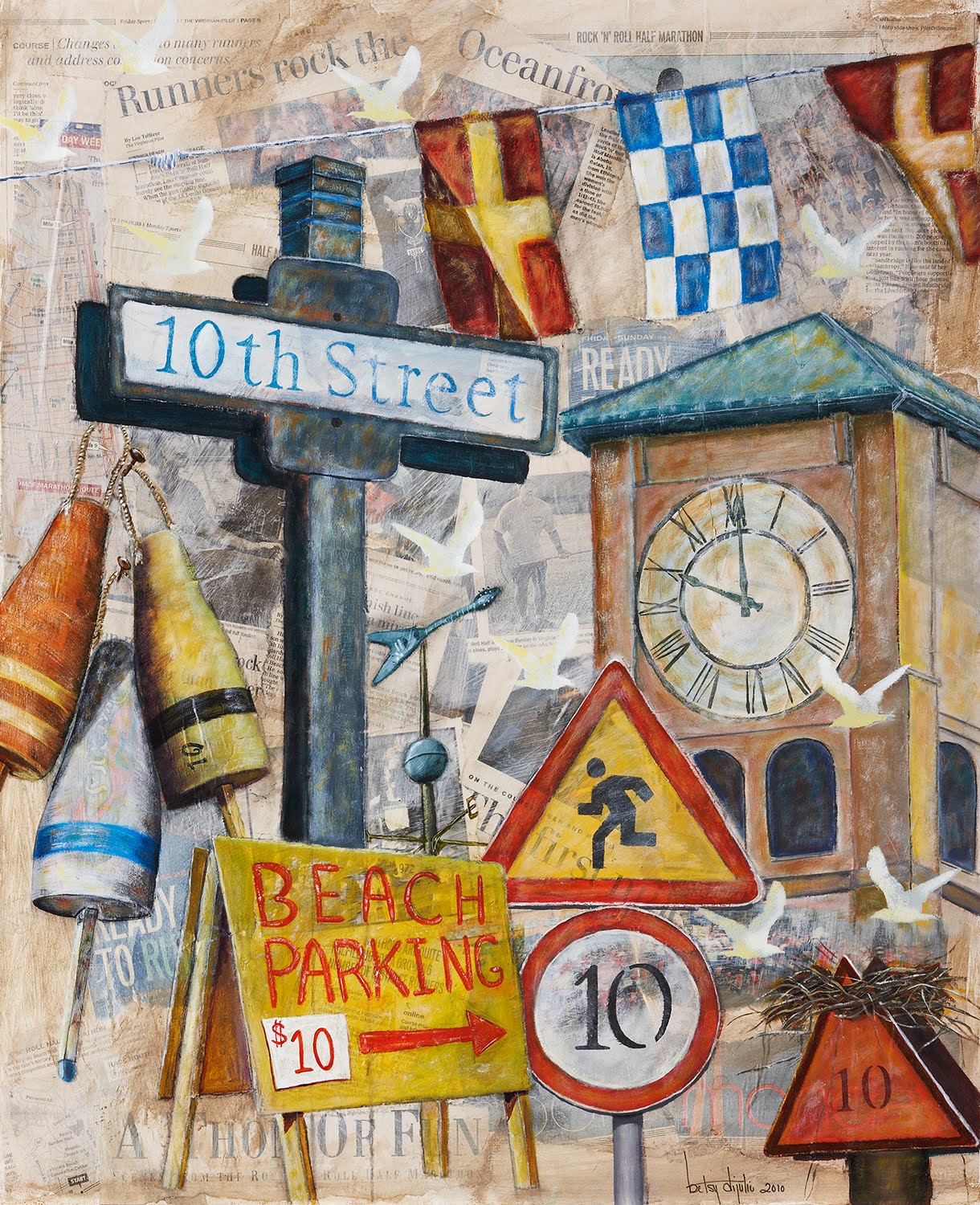
For all but the first year in 1990, I have been chosen as the volunteer "Official Artist" for the Virginia Beach Rock 'n' Roll Half Marathon put on by San Diego-based Competitor's Group. The race is held every Labor Day Weekend and here we are already at the 10th Anniversary. My original painting is raffled off annually and, in the last few years, has earned between $8,000 and $9,000 for the organization's charities, such as the Lymphoma and Leukemia Society. In addition, proceeds from the sale of posters made from the painting also benefit their charities.
My concept for this special commemorative edition was to paint beach-related objects with the number "10" on top of a collage of news clippings from past races, trying to use physical layers as a metaphor for the many layers of the race, from athletic achievement to personal triumph and much more. Early in the summer, my good friend Sharon Tanner accompanied me to the beach on a photo treasure hunt where we found the the 10th Street sign, the "$10 Beach Parking" sign, and the hotel clock tower. When we looked up and saw it, believe it or not, it was 10 a.m. The weather vane was inspired by one at Rudee Inlet for which I simply replaced the swordfish with a guitar.
Last summer, I became enamored with the crab/lobster buoys on a cruise up the coast of the Northeastern U.S. and, since we are known for our blue crabs and since the buoys are always identified by numbers, I had to include them based on an Internet source. I also used an Internet source for the "Runners Next 10 Miles" sign since I couldn't find exactly what I wanted. Even still, I had to combine two signs. And, while we have channel markers with osprey nests just like the one in the bottom right corner, we don't have them in the area where we were photographing, so I also used an Internet source for it. Finally, I used an Internet source for the nautical flags which have been a favorite symbol system of mine for many years; the ones in the painting spell out "RNR;" and the stenciled seagulls--10 of them, of course--provide movement and rhythm.
Each year, a highlight of the whole experience for me is signing posters for the runners and their families in the "Artist's Booth" at the Fitness Expo where all runners receive their registration packets. They come from all over the U.S. , some year after year. While I always love to meet the new participants, it is especially gratifying to laugh and joke with old acquaintances who return again and again, some with the addition of spouses, children and more children. Every year finds me laughing and crying--even blushing (I'll never forget the "Rock 'n' Roll Virgins")--in the booth as people request very personal inscriptions for their posters, some to honor loved ones whom they have lost and others to celebrate milestones.
It really is a "human race" and it is an incredible honor to be a small part.
Sunday, July 25, 2010
Virginia Summer Residential Governor's School for the Arts
 Last school year, I encouraged Erin Edwards, a rising senior, to apply for a month-long summer residential program called the Summer Residential Governor's Schools for the Arts. Our state, despite a tight budget, offered these once-in-a-lifetime opportunities again AT NO CHARGE this year as they have for who knows how many years to students in a wide range of disciplines. The various "schools" are held on different college campuses around Virginia. Hats off to the Commonwealth!
After a rigorous adjudication process locally and in Richmond, our capital, Erin was selected and what a fine choice they made! She invited me to Teacher Appreciation Day yesterday on the Radford University Campus (where this photo was taken--she's as beautiful inside as she is out). It is a 5 1/2 hour drive from here, but nothing could have kept me away. I was proud of her to begin with, but after I saw the work she had done, especially in her mixed-media drawing class and her sketchbook, I was doubly so.
As I walked around campus with her visiting her classes where mini-exhibitions were on display, the more formal gallery, chatting with her professors, and hearing all about her experience, I felt euphoric in the knowledge that she had embraced the experience in all its dimensions and it her. She seems to have tapped deeper into that place from which artmaking emerges with the knowledge that she really is, even at the ripe age of 17, a true artist. And I am beyond gratified that she wants to become an art teacher.
Tuesday, January 26, 2010
You're An Idiom!: Ceramic Portrait Busts (High School Art Unit)

The Art Problem:
This Creative Challenge invites students to interpret the idiom of their choice through the creation of clay sculptural busts (about 2/3 lifesize). In the example provided, my student Rachel A. chose the idiom "A Little Birdie Told Me" because of its relationship to high school gossip. Once fired, students enhance both the form and content of their pieces with a cold finish by, first, underpainting them in black, then dry brushing white or off-white over the black and, finally, adding highlights, shadows, mood and surface texture through mark-making in colored pencils.
Inspiration Artist:
Lesley Hildreth (she was also our visiting artist the first time I taught this challenge)Materials:
Clay compatible with your kiln and cones
Ware boards
Basic clay tools for cutting, incising, smoothing, scoring, piercing, embossing
Plastic for covering pieces while drying
Kiln, kiln furniture and conesBlack acrylic paint for under painting (we used spray paint) outdoors
White or off-white acrylic paint (dry brushed on)
Medium to medium-large brushes (foam works fine)
Colored pencils
Clear acrylic spray (we sprayed them outdoors)
Procedures:
Note: My students selected their idioms just prior to their midterm exam and drew thumbnails as part of their exam, though they were free to change their minds afterward.
Day 1--Introduction:
1. Show sample portrait bust and define idiom.
2. Hold an idiom-generating competition: challenge small teams of students to generate as many idioms they can in a specified amount of time. Have winning team read their list; other teams can add any additional ones from their lists. Give prizes to the team with the most.
3. Play Idiom Pictionary on the board. Give prizes to the team who gets the most correct answers.4. Introduce students to basic clay vocabulary and processes: wedge, score, slip, model, pinch, coil, slab, emboss, pierce, additive, subtractive, surface design. Per table or team of about 4 students, have two sets of different colored cards ready: vocabulary words on one set and definitions on another. Ask students to correctly match. Repeat on the next day of class as a hook/review.
Days 2 and 3--Facial Feature Practice:
5. Demonstrate modeling of facial features and let students practice with a small ball of clay. This is an excellent time to also instruct them in the way they should set-up and clean-up their work space.
Days 4-9 or 10--Construction:
6. Show YouTube demonstration video by Phillipe Faraut. In our case, Faraut makes the nose and lips a little differently than I learned from Hildreth and taught my students, so this gives the kids an option. Describe and diagram the building of shoulders and neck (a demo isn't really necessary once they see a sample and diagrams on the board).
7. Add head and begin making facial features. Have sample diagrams of facial anatomy from both front and profile views on view. Emphasize that the "egg-shaped" head must be placed on the neck at an angle AND that the front of the "egg" must be flattened slightly, making it perpendicular to the table, so that the face will be looking forward, rather than up (unless students want their heads looking up.) Also advise them that a slight tilt or turn of the head when they attach it to the neck can create a more lifelike quality.
8. Hollow out head and then torso and neck using a loop tool, preferably, though a spoon will work. To hollow out heads, use a clay cutter to remove the top of the cranium, and hollow down through the head to the neck, leaving a 3/4-1" wall. Replace the top of the head using scoring and some water or slip, if necessary. (It helps to make register marks so that the part of the head that is cut off can be positioned properly when it is reattached.) This will lighten the head so that the neck and torso can support it. Hollow them out next. Reshape any facial features if necessary.
9. Add any other elements, including hair and clothing, necessary to effectively interpret the idiom. Note: I tend to prefer these portrait busts without hair, though Faraut demonstrates an effective way to create hair that doesn't look like a rag mop.
4 Weeks (approximately)--Drying, Preheat and Firing:
10. Dry sculptures with plastic very loosely covering them. Have students check any thin elements. Spritz with water and cover those areas more tightly if necessary. It took ours about three weeks, not counting the preheat, to dry. To speed drying, tape three popsicle sticks together and carefully place two sets under the torso, one at each end. This will allow air to circulate underneath.
11. Preheat--as an extra precaution, I load the kilns and preheat them on low for about 45 minutes every day for about 4 days. After each preheat, I turn them off and just let them sit over night until the next day when I repeat the procedure.
12. Firing--on the 5th day, I fire them slowly and let them cool over the weekend.
1 Week--Cold Finish:
13. Students work outside in teams of 4 students, to spray paint their busts matte black; place newspaper under sculpture. Once dry--and the paint dries quickly--students bring them inside and dry brush the surfaces with white or off-white acrylic paint, leaving some black showing, especially in the crevices.
14. For the next couple of classes, students use colored pencils to build up a patinaed surface, with generally cool colors in the shadows and warm colors in the highlighted areas, that is, where light naturally strikes the sculpture. Encourage students to limit their dominant color palette and to build up their surfaces slowly while layering tones and letting some of their marks show.
15. Finish the sculptures outside with a couple of coats of a sprayed on clear acrylic finish.
Duration:
Intro, Facial Feature Practice and Construction--up to 4 weeks
Drying time + preheat and firing--4 weeks
Cold Finish--1 week
Assessment: Sailing the Seven C's Rubric
Extension: Group Critique and/or Written Artists' Statements
Big Ideas:
Artworks are objects for interpretation.
Art is a reflection of time, place and culture.
Meaningful artmaking is about exploration, asking questions, problem-solving and developing a knowledge-base.
Idioms are figurative language related to time, place and culture.
IB-MYP Area of Interaction: Depending on the student’s choice of idiom to interpret, s/he could focus on any of the Areas of Interaction with the most likely being: Health and Social Education and Environment
IB-MYP Unit Question: How can I create a ceramic portrait bust that allows me to explore and to express my understanding of a specific idiom while leaving the meaning open for interpretation by viewers?
Student Art Credit: Rachel A., "A Little Birdie Told Me"
Friday, January 22, 2010
Surrealism and One- and Two-Point Persepctive (High School Art Unit)


 Looking through some computer files, I stumbled across this unit from 2005-2006 that I created and taught to beginning students when I was a very new teacher. I see a fair number of perspective units that are problematic to me for a variety of reasons. But my iteration satisfactorily addressed most of my concerns. The students really enjoyed it and I am thinking of resurrecting it, perhaps with more emphasis on mark-making so that the pieces combine drawing issues with design.
 Or, observing that the paintings were a little "plain," my mentor, Nicole Brisco, suggested flipping them and having students make another drawing on top. She liked my idea in response to her suggestion: have students flip their pieces and repeat their compositions as simple contour drawings overlaid on their paintings. If we do the new, improved version of this Challenge, I'll be sure to post samples.
The Art Problem:
Students will explore both one-point perspective and surrealism through the creation of tempera paintings or tempera batiks that feature intriguingly ambiguous spaces and a sense of mystery.
Inspiration Artist: Craig Blair (older work)
Prerequisites:
Basic drawing experience
Basic composition experience
Basic color mixing with tempera (or build in a mini-lesson)
Criteria:
1. The composition must be based on 1-point perspective.
2. The artwork must possess a sense of mystery created by shadows or other dark areas, silhouettes, etc. (Mystery can also be created by your combinations of objects (e.g. objects that might not normally go together.)
3. The composition must include:
- Mostly hard-edged geometric shapes combined with one or two organic shapes/forms (like a plant, tree, bird, etc.). Note: some students didn't include the organic object, so it could be optional.
- An object somewhere in the composition that is drawn from 2-point perspective (a suitcase, a television, a box, etc.).
- A patterned floor, floor covering or walkway that follows the rules of 1 point perspective.
a platform or stairs. - A door, window, half-wall or opening of some kind between the foreground/middle ground space and the background space.
- An ambiguous spatial relationship somewhere in the piece.
Note: you may include other objects of your choice AS LONG AS YOU AVOID CLUTTERING THE COMPOSITION.
Materials:
Reproductions of Craig Blair's work (choose carefully as the quality varies)
Reproductions of other surreal images that emphasize ambiguous spaces, one- and two-point perspective and a sense of mystery (e.g. Giorgio de Chirico)
Sketchbooks
Pencils
Erasers
Rulers
Manila drawing paper
Tempera paint
Brushes (+ water, cans to hold water, newspapers, paper towels)
If creating tempera batiks:
Black India ink
Cafeteria-style trays or clear pieces of acrylic or Plexiglas the size of the artwork or slightly larger
Procedures:
- Set the stage with an art criticism activity related to the inspiration artist being sure to define "surrealism."
- Incorporate an art historical surrealist antecedent such as Giorgio de Chirico by comparing his work with Craig Blair's.
- Explain parameters of this Creative Challenge.
- Teach a simple one-point and two-point perspective mini-lesson.
- Direct students in the creation of thumbnail sketches that fit within the project parameters; help them choose the most successful idea and composition, combining aspects into another thumbnail if necessary.
- Transfer thumbnails to larger paper.
- If creating straight paintings, instruct them in the painting of their compositions with tempera. Require students to use a limited color palette of mixed "ish" colors (see glossary); if desired, instruct them in the defining of edges through graphite or ink marks.
- If creating tempera batiks, students do the following: paint each area of their paintings using about three thick coats. They should NOT paint over the lines, but should leave the paper exposed where the lines are. (Tracing over the lines in light colored chalk helps remind them not to paint over the lines.) Once tempera is completely dry, they completely cover the ENTIRE surface of their paintings with black India ink. Foam brushes work well for this. Once the ink is barely dry--it should not sit on the paintings for an extended period--they should place their paintings on cafeteria-type trays or pieces of acrylic or Plexiglas and gently rinse the ink off using a slow stream of water or water poured from a container over the sink. They should control how much ink is removed by rubbing gently with their fingers. The ink will soak into the exposed paper where the lines were drawn but not painted over AND it will adhere in a random way to the surface of the tempera paint creating a batik-like effect.
Assessment: Score and comment on each piece using the "Sailing the Seven Seas" rubric. (Sometimes I have the students score their own work first using the rubric, explaining that my scores will "trump" theirs, but that it is important for them to evaluate their own work.)
IB-MYP Area of Interaction: Environment (physical and psychological)
Art Credits (top to bottom): Craig Blair; students: Cameron R., Ariel T., Kelly B., T.H.
Subscribe to:
Posts (Atom)


