Tuesday, January 26, 2010

You're An Idiom!: Ceramic Portrait Busts (High School Art Unit)


The Art Problem:

This Creative Challenge invites students to interpret the idiom of their choice through the creation of clay sculptural busts (about 2/3 lifesize). In the example provided, my student Rachel A. chose the idiom "A Little Birdie Told Me" because of its relationship to high school gossip. Once fired, students enhance both the form and content of their pieces with a cold finish by, first, underpainting them in black, then dry brushing white or off-white over the black and, finally, adding highlights, shadows, mood and surface texture through mark-making in colored pencils.

Inspiration Artist:
Lesley Hildreth (she was also our visiting artist the first time I taught this challenge)

Materials:

Clay compatible with your kiln and cones

Ware boards

Basic clay tools for cutting, incising, smoothing, scoring, piercing, embossing

Plastic for covering pieces while drying

Kiln, kiln furniture and cones

Black acrylic paint for under painting (we used spray paint) outdoors

White or off-white acrylic paint (dry brushed on)

Medium to medium-large brushes (foam works fine)

Colored pencils

Clear acrylic spray (we sprayed them outdoors)


Procedures:
Note: My students selected their idioms just prior to their midterm exam and drew thumbnails as part of their exam, though they were free to change their minds afterward.

Day 1--Introduction:
1. Show sample portrait bust and define idiom.

2. Hold an idiom-generating competition: challenge small teams of students to generate as many idioms they can in a specified amount of time. Have winning team read their list; other teams can add any additional ones from their lists. Give prizes to the team with the most.

3. Play Idiom Pictionary on the board. Give prizes to the team who gets the most correct answers.

4. Introduce students to basic clay vocabulary and processes: wedge, score, slip, model, pinch, coil, slab, emboss, pierce, additive, subtractive, surface design. Per table or team of about 4 students, have two sets of different colored cards ready: vocabulary words on one set and definitions on another. Ask students to correctly match. Repeat on the next day of class as a hook/review.

Days 2 and 3--Facial Feature Practice:
5. Demonstrate modeling of facial features and let students practice with a small ball of clay. This is an excellent time to also instruct them in the way they should set-up and clean-up their work space.


Days 4-9 or 10--Construction:
6. Show YouTube demonstration video by Phillipe Faraut. In our case, Faraut makes the nose and lips a little differently than I learned from Hildreth and taught my students, so this gives the kids an option. Describe and diagram the building of shoulders and neck (a demo isn't really necessary once they see a sample and diagrams on the board).

7. Add head and begin making facial features. Have sample diagrams of facial anatomy from both front and profile views on view. Emphasize that the "egg-shaped" head must be placed on the neck at an angle AND that the front of the "egg" must be flattened slightly, making it perpendicular to the table, so that the face will be looking forward, rather than up (unless students want their heads looking up.) Also advise them that a slight tilt or turn of the head when they attach it to the neck can create a more lifelike quality.

8. Hollow out head and then torso and neck using a loop tool, preferably, though a spoon will work. To hollow out heads, use a clay cutter to remove the top of the cranium, and hollow down through the head to the neck, leaving a 3/4-1" wall. Replace the top of the head using scoring and some water or slip, if necessary. (It helps to make register marks so that the part of the head that is cut off can be positioned properly when it is reattached.) This will lighten the head so that the neck and torso can support it. Hollow them out next. Reshape any facial features if necessary.

9. Add any other elements, including hair and clothing, necessary to effectively interpret the idiom. Note: I tend to prefer these portrait busts without hair, though Faraut demonstrates an effective way to create hair that doesn't look like a rag mop.

4 Weeks (approximately)--Drying, Preheat and Firing:
10. Dry sculptures with plastic very loosely covering them. Have students check any thin elements. Spritz with water and cover those areas more tightly if necessary. It took ours about three weeks, not counting the preheat, to dry. To speed drying, tape three popsicle sticks together and carefully place two sets under the torso, one at each end. This will allow air to circulate underneath.

11. Preheat--as an extra precaution, I load the kilns and preheat them on low for about 45 minutes every day for about 4 days. After each preheat, I turn them off and just let them sit over night until the next day when I repeat the procedure.

12. Firing--on the 5th day, I fire them slowly and let them cool over the weekend.


1 Week--Cold Finish:
13. Students work outside in teams of 4 students, to spray paint their busts matte black; place newspaper under sculpture. Once dry--and the paint dries quickly--students bring them inside and dry brush the surfaces with white or off-white acrylic paint, leaving some black showing, especially in the crevices.

14. For the next couple of classes, students use colored pencils to build up a patinaed surface, with generally cool colors in the shadows and warm colors in the highlighted areas, that is, where light naturally strikes the sculpture. Encourage students to limit their dominant color palette and to build up their surfaces slowly while layering tones and letting some of their marks show.

15. Finish the sculptures outside with a couple of coats of a sprayed on clear acrylic finish.

Duration:
Intro, Facial Feature Practice and Construction--up to 4 weeks
Drying time + preheat and firing--4 weeks
Cold Finish--1 week

Assessment: Sailing the Seven C's Rubric

Extension: Group Critique and/or Written Artists' Statements

Big Ideas:

Artworks are objects for interpretation.
Art is a reflection of time, place and culture.
Meaningful artmaking is about exploration, asking questions, problem-solving and developing a knowledge-base.
Idioms are figurative language related to time, place and culture.

IB-MYP Area of Interaction: Depending on the student’s choice of idiom to interpret, s/he could focus on any of the Areas of Interaction with the most likely being: Health and Social Education and Environment

IB-MYP Unit Question: How can I create a ceramic portrait bust that allows me to explore and to express my understanding of a specific idiom while leaving the meaning open for interpretation by viewers?

Student Art Credit: Rachel A., "A Little Birdie Told Me"

Friday, January 22, 2010

Surrealism and One- and Two-Point Persepctive (High School Art Unit)


Looking through some computer files, I stumbled across this unit from 2005-2006 that I created and taught to beginning students when I was a very new teacher. I see a fair number of perspective units that are problematic to me for a variety of reasons. But my iteration satisfactorily addressed most of my concerns. The students really enjoyed it and I am thinking of resurrecting it, perhaps with more emphasis on mark-making so that the pieces combine drawing issues with design.

Or, observing that the paintings were a little "plain," my mentor, Nicole Brisco, suggested flipping them and having students make another drawing on top. She liked my idea in response to her suggestion: have students flip their pieces and repeat their compositions as simple contour drawings overlaid on their paintings. If we do the new, improved version of this Challenge, I'll be sure to post samples.

The Art Problem:
Students will explore both one-point perspective and surrealism through the creation of tempera paintings or tempera batiks that feature intriguingly ambiguous spaces and a sense of mystery.

Inspiration Artist: Craig Blair (older work)

Prerequisites:
Basic drawing experience
Basic composition experience
Basic color mixing with tempera (or build in a mini-lesson)

Criteria:
1. The composition must be based on 1-point perspective.

2. The artwork must possess a sense of mystery created by shadows or other dark areas, silhouettes, etc. (Mystery can also be created by your combinations of objects (e.g. objects that might not normally go together.)

3. The composition must include:

  • Mostly hard-edged geometric shapes combined with one or two organic shapes/forms (like a plant, tree, bird, etc.). Note: some students didn't include the organic object, so it could be optional.
  • An object somewhere in the composition that is drawn from 2-point perspective (a suitcase, a television, a box, etc.).
  • A patterned floor, floor covering or walkway that follows the rules of 1 point perspective.
    a platform or stairs.
  • A door, window, half-wall or opening of some kind between the foreground/middle ground space and the background space.
  • An ambiguous spatial relationship somewhere in the piece.

    Note: you may include other objects of your choice AS LONG AS YOU AVOID CLUTTERING THE COMPOSITION.

Materials:

Reproductions of Craig Blair's work (choose carefully as the quality varies)

Reproductions of other surreal images that emphasize ambiguous spaces, one- and two-point perspective and a sense of mystery (e.g. Giorgio de Chirico)

Sketchbooks

Pencils

Erasers

Rulers

Manila drawing paper

Tempera paint

Brushes (+ water, cans to hold water, newspapers, paper towels)

If creating tempera batiks:
Black India ink

Cafeteria-style trays or clear pieces of acrylic or Plexiglas the size of the artwork or slightly larger

Procedures:
  1. Set the stage with an art criticism activity related to the inspiration artist being sure to define "surrealism."

  2. Incorporate an art historical surrealist antecedent such as Giorgio de Chirico by comparing his work with Craig Blair's.

  3. Explain parameters of this Creative Challenge.

  4. Teach a simple one-point and two-point perspective mini-lesson.

  5. Direct students in the creation of thumbnail sketches that fit within the project parameters; help them choose the most successful idea and composition, combining aspects into another thumbnail if necessary.

  6. Transfer thumbnails to larger paper.

  7. If creating straight paintings, instruct them in the painting of their compositions with tempera. Require students to use a limited color palette of mixed "ish" colors (see glossary); if desired, instruct them in the defining of edges through graphite or ink marks.
  8. If creating tempera batiks, students do the following: paint each area of their paintings using about three thick coats. They should NOT paint over the lines, but should leave the paper exposed where the lines are. (Tracing over the lines in light colored chalk helps remind them not to paint over the lines.) Once tempera is completely dry, they completely cover the ENTIRE surface of their paintings with black India ink. Foam brushes work well for this. Once the ink is barely dry--it should not sit on the paintings for an extended period--they should place their paintings on cafeteria-type trays or pieces of acrylic or Plexiglas and gently rinse the ink off using a slow stream of water or water poured from a container over the sink. They should control how much ink is removed by rubbing gently with their fingers. The ink will soak into the exposed paper where the lines were drawn but not painted over AND it will adhere in a random way to the surface of the tempera paint creating a batik-like effect.

Assessment: Score and comment on each piece using the "Sailing the Seven Seas" rubric. (Sometimes I have the students score their own work first using the rubric, explaining that my scores will "trump" theirs, but that it is important for them to evaluate their own work.)

IB-MYP Area of Interaction: Environment (physical and psychological)

Art Credits (top to bottom): Craig Blair; students: Cameron R., Ariel T., Kelly B., T.H.

Trash to Treasure (High School Art Mini-Lesson)


This mini-lesson was published as a "Clip Card" in the February issue of SchoolArts Magazine:

The Art Problem
Students will work with the concept of nature vs. culture as they create a unified painted and drawn composition based on a combination of man-made and natural objects found on a walk.

Materials
(Note: this challenge could be approached with any number of media, so use whatever you have.)
3 to 5 man-made or natural objects found on a walk(s)
Pencils
Watercolor Paper
Watercolor (limit palette to 3 related and neutralized colors)
Brushes
Sharpie marker

Procedures
1. Take students, each one armed with a resealable plastic bag, on short walks or "treasure hunts" over the course of several days. Or, assign the walks as "homework." On the walk, ask students to pick up both man-made and natural objects avoiding anything dangerous or excessively dirty.
2. Ask students to choose a combination of 3-5 of the objects, most of which are unified by shape, but 1 or 2 that contrast. (For the artwork accompanying this post, Grace used a cup with a lid and straw, a tape dispenser, a ziplock bag and acorns.)
3. Once students have chosen their objects, ask them to create one or more thumbnail sketches of their objects, emphasizing unity and movement through shape and weighted line, as well as emphasis through a contrasting shape. Encourage them to "zoom in" and crop.
4. Help each student select the best composition to enlarge. Once they have transferred the drawing, ask them to further emphasize the elements and principles mentioned above in three related and neutralized color washes and Sharpie marker.

Student Extension
Photograph and print out in black and white each students drawing and ask them to emphasize a different set of elements and principles, e.g. positive and negative space.

Student Artwork Credit: Grace G. (Watercolor and black Sharpie marker)

Compositional Strategies--Mini Lesson

Ideas come in all kinds of packages. Yesterday, I received a beautiful poster from SCAD. As soon as I unfolded it, I knew exactly what I would do with it: a Compositional Strategies classroom competition. The prize: a sketchbook I had received through a promotion.

This week and last, I had been working with my students on Compositional Strategies: a series of specific design strategies that they can turn to--and adapt in their own ways--when trying to resolve compositional issues in their work.

I use a series of jpgs from my teaching-artist mentor Nicole Brisco's sketchbook that illustrates each of the strategies, along with photocopoies of a drawing I made. I use the latter as a worksheet in which they identify the various strategies. The list of strategies is organic and growing and can, essentially, include any approach to composition that you favor.

Most of them help create Unity, though some relate to Focal Point, Movement and connecting positive and negative Space. Included are such things as:

  • Repeated Shapes, Colors, etc.
  • Geometric Shape to Isolate a Focal Point
  • Subliminally Repeated Patterns (e.g. hatch marks and stripes)
  • Continuous Line to Unify Sides of a Composition or Foreground and Background
  • Extended Lines (from the edges of objects)
  • Repeated Motif to Create Movement
  • A Motif Extrapolated from a Pattern (e.g. a square "pulled out" of a plaid pattern)
  • Insets (pictures within pictures--sometimes 1, but often in a series of 3)
  • Echo Lines (like concentric ripples when a pebble is dropped in water)
  • Halos (to separate two areas that would otherwise merge, e.g. an object against a ground of the same color)
  • Text in the Ground (handwriting, print, stenciled letters)
  • Stylized View of an Object from an Unexpected Perspective to Create a Repeating Motif
  • Object Repeated as a Modeled Drawing, Contour Drawing and Silhouette

The competition was simple: with the poster image concealed, I told the class that after we reviewed the Compositional Strategies, I was going to reveal an image that makes obvious use of one of the strategies in particular. I explained that the first person to yell out the correct one and wave his or her hand would win the sketchbook.

The competition was intense, but Troy J. won by identifying "Geometric Shape to Isolate a Focal Point" because of the window around the woman's eye.

Extension: Analyze and interpret the image. Perhaps the meaning of the image is related to the notion that the eyes are the "windows of the soul."

Wednesday, January 20, 2010

Wolf Kahn-Inspired Abstract Landscapes (High School Art Unit)


The Art Problem:
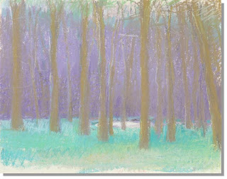
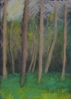
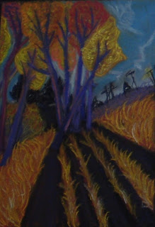
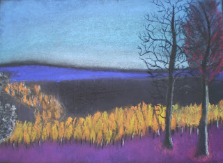
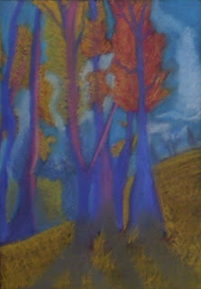
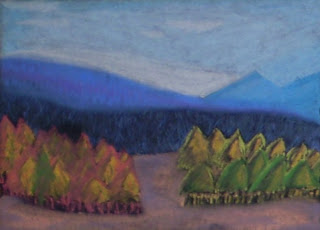
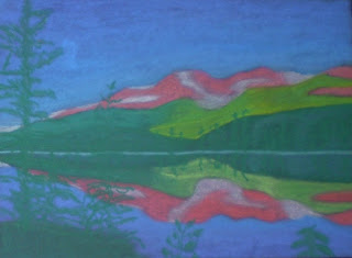
This Creative Challenge invites students to explore mark-making, texture, shape, space, color, abstraction and mood through pastel landscapes inspired by the work of American master, Wolf Kahn. Creating the images on a black ground causes the colors to really "sing" on the paper.

Materials:
Reproductions of Wolf Kahn pastel landscapes
Selection of the students' own or non-copyrighted landscape photographs (I found a large selection of images in the public domain online through the National Park Service "Digital Image Archive." All images are free and may be used without a copyright release. I printed them out 8.5 x 11", put them in clear page protectors, and use them again and again. This is an excellent opportunity to discuss artistic plagiarism.)
Sketchbook or sketch paper
Pencils
Erasers
Black construction paper, black drawing paper or black pastel paper
Masking tape (to mask border of paper)
White charcoal pencils if needed for sketches to show up on black paper
Selection of colored chalk or soft pastels

Prerequisites:
Basic drawing and composition experience

An understanding of and sketchbook practice with mark-making techniques (hatching, cross-hatching, stippling, etc., including students' own inventive marks)

Basic familiarity with color "mixing" and layering with chalk or soft pastels (or just build in a mini-lesson)

Basic understanding of composition and Elements and Principles of Design

Basic familiarity with color "mixing" and layering using chalk or soft pastels

Individual Student Procedures:
1. Introduce the work of Wolf Kahn. You might do this by giving small groups of students a Wolf Kahn reproduction plus a reproduction of a more realistic landscape and asking them to compare/contrast and then share answers with whole class. The point is to help students recognize basic characteristics of Kahn's pastel landscapes: simplified and often geometric shapes, vivid and sometimes non-local color, color registers or bands of color, a general flattening out of form, etc.

2. Follow the above introductory exercise with a second transitional excercise: place a transparency of Kahn's work on a transparency projector and cover it with a clear transparency sheet. Working with student volunteers and 3-4 images in succession, invite each student to quickly trace the basic shapes of the composition with a transparency marker. After each has completed the tracing, remove the transparency of the artwork so that just the student's diagram of the composition remains. Discuss.
3. Share biographical information about Kahn as desired.

4. Spread out photographs around room and ask students to choose their favorite.

5. Next, students create a thumbnail sketch of their image in pencil and colored pencil. Many students will start out to realistic. Keep reminding them that they are trying to capture the "essence" of the place by doing as Kahn did: reducing forms to simple shapes, exaggerating color and shadow, using mark-making strategies to create contrasting textures, etc. Help them layer varied marks of colors to create secondary and intermediate colors instead of blending. Continually remind them that they are not "copying" the image, but "interpreting" it through abstraction.

6. Students then mask the edges of their black paper with masking tape and translate their thumbnails using white charcoal pencils (or anything that will show up on the paper).

7. Finally, they apply color using chalk or soft pastels. When finished, they fix the image with Workable Fixatif and remove their tape for display.

Assessment:
Score and comment on pieces according to the "Sailing the 7 Cs" visual arts rubric

IB-MYP Area of Interaction: Environment

Extension: Challenge students to create a monoprint of their image. After their pastels are finished, lay a piece of plastic wrap over each image to protect them. Then instruct each student to lay a piece of Plexiglas or acetate over his or her image and trace onto it the basic shapes of his or her composition with a greasy pencil like a china marker. Remove the Plexi/acetate and plastic wrap and put the pastel drawing in a safe place. Next students add color to their compositions with either quickly painted on block printing ink or Caran d'ache water soluble oil pastels (other brands seem not to work). Finally, using pressure from their hands, a brayer, a wooden spoon, or a printmaking press, they transfer their images from the Plexi/acetate onto paper (dry paper for damp block printing ink; barely damp paper for water soluble oil pastels).
Artwork Credits (top to bottom): Wolf Kahn; student artists: Marcus J., Maggie D., *Unknown, *Unknown, Heather J., Sarah G., and Aurelie T.
*I last gave this Creative Challenge in 2007-2008 and cannot recall whose pieces those were; my apologies for not labeling these images.

Friday, January 15, 2010

Hook: Sand Animation (Part 2--Final) by Kseniya Simonova from "Ukraine's Got Talent"


As a follow up to my "hook" using "Part 1" of Simonova's performance (see January 13, 2010 post), I showed "Part 2--Final" and asked the following question for students to discuss in small groups, record answers in their sketchbooks, and share with the whole class:

How does this performance compare to "Part 1" in terms of:
  1. Subject/content?
  2. The artmaking process?
  3. Emotion?
  4. Role of music?
  5. Role of choreography?
  6. Anything else?

Again, the students were very insightful in their analysis via comparisons. And, while they felt that this performance did not achieve the same level of power as the first, they were very respectful in how they phrased what they had to say, and they supported their arguments with astute examples.

Thursday, January 14, 2010

Pin Point-of-You (High School Art Unit)


Named by my class, the title of this "Creative Challenge" is a play on the phrase "point of view." The "pin" refers to the required inclusion of clothes pins as metaphors for "connections." Students expressed these personal connections by creating and then making graphite drawings of individual still lifes of clothespins and objects that symbolize what they feel "connected to."

Stay tuned for the entire plan and more images soon.
Student art credits (top to bottom): Mary B., Jenny D., Erin E., Anthony M., Alysha S.

Wednesday, January 13, 2010

Hook: Sand Animation, "Part 1," by Kseniya Simonova from "Ukraine's Got Talent"


A colleague emailed me the link to this YouTube video at school and and an artist friend emailed it to me at home. I had saved the first message to look at when I got a chance, but when I received the second message, I decided I needed to check it out right away. Am I ever glad I did! (Note: if the link becomes inactive, just do an internet search of "Kseniya Simonva Sand Animation," but make sure you find the one that begins with her lighting a candle.)
Many of you have probably seen this young artist, Kseniya Simonva's, moving and highly expressionistic tribute to the sacrifices of her countrymen during World War II. A fusion of visual art (drawings made in sand on a light table and projected in real-time onto a large screen), music and choreography, the performance is utterly captivating. Though a very few of my students had seen it, it didn't matter: they were instantly immersed in it again.
All of my students--even a few with "focus issues"--were riveted. I don't think it would be an exaggeration to say that they were transfixed. You could have heard a pin drop during the entire 8-minute performance in every one of my five classes. (Well, okay, one student with attention deficit issues in one class wasn't completely spell-bound, but...) At the conclusion, the silence lingered; it was almost as if they didn't want to break the spell.
And as much as I hated to be the one to do it, I wanted them to analyze and reflect while their memories were fresh. So, I posed the following four questions to be discussed as a group with answers recorded in their sketchbooks and then shared with the whole class. The depth of their insights--even those of some of my less academic students--was gratifying and heartwarming.
Questions for Small Group (by table) and Whole Class Discussion:
  1. What did you find to be the most powerful aspects of this performance?
  2. What roles did music play?
  3. What role did choreography play?
  4. What was the significance of the candle

I hope you'll consider incorporating this short video into your instruction. You won't be sorry.

Friday, January 8, 2010

The Beast Within (High School Art Unit)


The Art Problem:
This Creative Challenge invites students to create a conceptual self-portrait by integrating drawings or paintings of the "zoomed in" bones of a human being (from a skeletal model) with the skeleton of their individual "power animal," as defined by various shamanistic traditions.
Materials:
Human skeletal models (I borrowed them from our health and science departments)
"Power Animal" handout (do an Internet search of "power animals" or "spirit animals" to find your favorite site that provides a brief definition and provides a list of animals and the characteristics they embody; there are even "tests" to help students identify their animal)
Printouts of animal skeletons from the Internet
Sketchbook or sketch paper
Pencils
Erasers
Watercolor paper, tag board or corrugated cardboard (many students used the latter to great effect)
Masking tape (to tape margins of support)
Acrylic paint
Palettes, brushes, water, containers
Optional:
Matte medium or ever-so-slightly watered down glue
Glue
Box cutters and cutting boards
Black permanent markers

Prerequisites:
An understanding of and sketchbook practice with modeling techniques (hatching, cross-hatching, stippling, cross-contour marks, etc.)
Familiarity with "weighted line" (widened and tapered line) and varied line quality
Knowledge of a value scale
Basic understanding of composition and Elements and Principles of Design
Basic painting introduction or experience, including paint mixing (especially monochromatic tints and shades)
Individual Student Procedures:
1. Teacher introduces Creative Challenge, including the concept of a "power animal."
2. Working from skeletal models, students draw modeled thumbnails of zoomed-in and cropped bones; students should incorporate all they know about strong composition in each thumbnail.
3. Discuss power animals; spend most of a class in the computer lab allowing students to identify their individual power animals and search/printout skeletons of their animals. (There is a lot of information online.) Glue pertinent references into sketchbooks.
4. Generate thumbnail sketches that incorporate human bones with the skeletons of their power animals.
5. Introduce Georgia O’Keefe’s paintings of animal bones. (See "Hooks and Mini-Lessons" below.)
6. Introduce the "Creative Problem Solving" (CPS) strategy "SCAMPER" (see "Hooks and Mini-Lessons" below) and discuss application to this Creative Challenge.
7. Students revisit their thumbnail sketches in light of "SCAMPER" and make revisions as desired/needed. Discuss various students’ solutions as a class to spark more innovative solutions.
8. In conjunction with teacher, students choose their strongest thumbnail sketches.
9. Students transfer thumbnails to supports (we used watercolor paper, tag board and corrugated cardboard), drawing and painting according to any parameters your choose, e.g. for intermediate students, I limited their palette to neutral warm and cool whites and grays, while advanced students were allowed to use additional color, but with limited palettes. I also encouraged all but the least experienced students to paint some significant aspect of their compositions.

Hooks and Mini-Lessons:
[Use at the beginning of classes as desired.]

Problem Solving: Introduce the "Creative Problem Solving" (CPS) strategy "SCAMPER" and discuss its application to this Creative Challenge. In brief, SCAMPER is an acronym in which each letter is the first letter of a word that can be applied to a problem to arrive at a novel solution: S-Substitute, C-Combine, A-Adapt, M-Magnify, Minify, Multiply, P-Put to Other Uses, E-Eliminate, R-Reverse/Rearrange. (Search "Creative Problem Solving Strategy: SCAMPER" on this blog.) My SCAMPER Handout is laid out "two-up," so that it can be cut in half and glued neatly into most sketchbooks. Innovation Station alternative: instead of a whole class discussion, you may assign each letter in the SCAMPER acronym to small groups of students and ask each group to generate solutions to the given task using their letter and then share with the whole class.

Art Criticism: Introduce Georgia O’Keefe and her animal bone paintings from the time of her life spent in the American Southwest. Provide students with a brief bio and project a few of her best known paintings to familiarize them with her work. Then engage students in the following Innovation Station "hooks" on two successive days.

Innovation Station Hook 1: Because I find that students struggle with the difference between analysis and interpretation and, especially, that each point of analysis should correlate to each point of interpretation, I developed the following activity:
Introduce the four-step process of Art Criticism: Describe, Analyze, Interpret, Evaluate. Emphasize the analysis "breaks artwork apart" in terms of the Elements and Principles of Design, whereas Interpretation "puts it back together" in terms of meaning, communication, expression.
Then, project "Red Hills and Bones," 1941, Georgia O’Keefe.
Divide students into small groups and give each group a set of about 6 small squares of paper of one color and 6 of another (I used orange and green construction paper).
Ask them to write points of Analysis, one point per card, on each of the orange cards.
Then ask them to correlate each point of Analysis with an interpretive statement written on the green cards, one statement per card. They should all match.
Then, groups shuffle their cards, trade with another group, match the cards up correctly and share responses with the whole class.
What I found was that my students are strong when it comes to analyzing, but not as much when it comes to interpretation. In other words, on an orange card, they might write: "Forms of bones are repeated in the hills," and then on the green card, they would write, "Creates Unity." That would be correct except that both statements relate to Analysis.
So, after making some gentle corrections and praising them on their analysis, I asked each team to correct the statements on the green cards making them statements of Interpretation rather than Analysis.
I admit that the process was a struggle and a challenge for them—a bit like pulling teeth in some cases-—but they ultimately got it as evidenced by their response to the next day’s hook.

Innovation Station Hook 2:
I created two worksheets, one for half the class and one for the other, which featured one of Georgia O’Keefe’s bone paintings and, underneath, two columns: one for Analysis and one for Interpretation.
In the Analysis column, I filled in a few key points.
In the Interpretation column, I left blank lines that corresponded with each point of Analysis. Underneath each blank line, I wrote a hint.
The students’ task was to study the image, read the points of Analysis and write a corresponding statement of interpretation for each one.
Next, I projected each image and we discussed them as a whole class with input from each of the groups.
Across the board, they did an excellent, thoughtful job, not content to reside at the "surface" of meaning.

Assessment:
Score and comment on pieces according to the "Sailing the 7 Cs" visual arts rubric

IB-MYP Area of Interaction: Health and Social

Student Samples (Intermediate): Grace M., Maggie Q., Laura M., Mary B., Stephanie B., Kendria T., Nick G., Kara N., Polett B., Raymond (Trey) K., Daniel B., and (AP Studio):Danica G.

Thursday, January 7, 2010

Make Your Mark (High School Art Mark-Making Mini-Lesson)


Following is the text from a "Clip Card" I wrote that was published in the January 2010 issue of SchoolArts Magazine.
The Art Problem
Students will create a new work of art by drawing on top of a copy of a previous piece of their own work. With the possibility for "messing up" their artwork removed, students will be encouraged to boldly explore mark-making strategies and create expressive works that enhance formal and emotional impact.

Materials
Previous made student artwork
Digital camera
8 ½ x 11" (21 x 28 cm) full-color copies of student artwork on white printer paper or cardstock (two or more copies per student)
Black ball-point pens
Black Permanent Markers

Procedures
1. Prior to class, photograph student artwork and print full-color copies for each student on white printer paper or cardstock.
2. Challenge students to use black ballpoint pen and permanent marker to work on top of the copied image with weighted lines (continuous lines of varying thicknesses), lines of varying qualities, and other types of marks (hatching, cross-hatching, stippling, etc.)
3. Encourage students to explore how they can more effectively use mark-making to manipulate elements and principles of design, such as emphasis, value, and repetition/pattern while refining edges and creating a greater sense of volume to produce more visually interesting and engaging works of art.

Assessment
Invite students to create more drawings by using different approaches to mark-making on top of additional copies of the same piece of their art. If time allows, ask students to choose the most and least successful drawings and explain why in a journal entry using careful analysis and appropriate art vocabulary.

Illustration Credits: Anthony M.
The top image is Anthony's ink-on-computer printout piece created in response to this challenge. The bottom image is his original acrylic painting from which I made the computer printout that he worked back into with the ink.

Creative Problem Solving Strategy: SCAMPER (in the High School Art Classroom)


What is SCAMPER?

As art teachers, each Creative Challenge in our courses is, essentially, a "problem" to solve.

SCAMPER is a Creative Problem Solving strategy (CPS), created by Dr. Donald Treffinger and Carole Nassab of the Center for Creative Learning, that allows students to generate their own innovative solutions to a wide range of problems. The process literally helps them generate infinite possibilities so that they need never be at a loss for a creative solution to a problem again!

Plus, it not only works in art or just for students, but in any area in which people are solving problems with concrete outcomes--whether in school, business, or home life--including lesson and unit planning for teachers.

SCAMPER is an acronym. Each letter is the first letter of a process that one can apply to the problem. Following are a few examples that only scratch the surface. Use YOUR imagination:

S = Substitute (replace one thing with another, e.g. an object, a media, etc.)
C = Combine (combine objects or parts of objects, media, ideas, etc)
A = Adapt (borrow something from another context)
M = Magnify, Minify, Multiply (make some part larger, smaller or repeat it; zoom in or zoom out)
P = Put to Other Uses (change the intended function of an object, a tool, etc.)
E = Eliminate (remove some aspect or parts; cut something out; cut part of something away)
R = Rearrange/Reverse (move objects around; rotate or flip objects or the whole piece)

After taking a workshop about CPS taught by Chris Buhner, I introduced SCAMPER last year in my Art Foundations classes and, as I learned yesterday, the students still remembered what the letters stand for! I have found it to be an invaluable tool and hope you will too.

Illustration credit: Ryan R. (Advanced Art)

We called the Creative Challenge to which this piece was a response "The Beast Within." I challenged students to combine human bones drawn from actual skeletal models with drawings of the skeleton of their personal "power animal" (printed from the Internet) after briefly discussing this shamanistic belief. Students enjoyed identifying their power animal and I encouraged them to "push" the assignment beyond my parameters.

Ryan's finished mixed-media piece is a good example of how a student might use SCAMPER to arrive at an original solution. For example, in particular, he did the following:

C - combined drawings of muscles with the required drawings of the bones
M - magnified the muscle drawings
R - rearranged the muscle drawings by placing them in insets and moving them around the composition until he achieved the balance he sought
Related Posts with Thumbnails