

 The Art Problem:
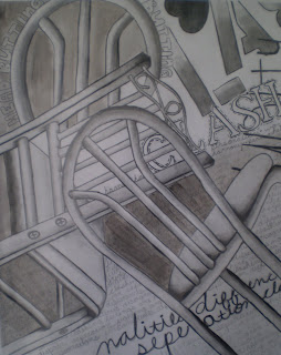
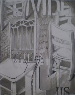
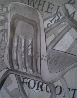
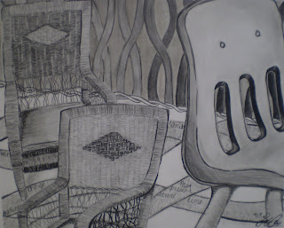
This Creative Challenge is a spin on the negative command "Sit down and shut up." It invites students to "speak up" in relation to an issue about which they feel strongly. The vehicle for communication is a metaphorical drawing that makes use of chairs drawn realistically from observation, as well as both handwritten and stenciled text. Irrespective of the words, the style, size and placement of the chairs should communicate the student’s issue. The text should embellish, enhance and reinforce. It should NOT look like a label on a poster!
Materials:
A variety of chairs [we used a white wicker rocker, a child’s white wooden rocker, school chairs, a plastic folding chair, three different "bistro" chairs (1 all wood and 2 that were metal with upholstered seats, one with an angular back and the other with a curved back), and a couple of stools]
Sketchbook or sketch paper
Pencil
Eraser
Optional: Viewfinder
Pencil value scale
White tag board (we like to use 14 x 17" with a 1" taped border all the way around)
Ebony pencils
Stencils in a variety of fonts and sizes
Several values of "Dirty Water Wash" (a very small amount of black and brown, even a little blue, mixed with a large quantity of water to make a cool or slightly warm gray wash)
Brushes
An understanding of and sketchbook practice with modeling techniques (hatching, cross-hatching, stippling, cross-contour marks, etc.)
Familiarity with "weighted line" (widened and tapered line) and varied line quality
Knowledge of a value scale
Basic understanding of composition and Elements and Principles of Design
Individual Student Procedures:
1. Choose an issue to communicate (not just a concept, but a compelling issue about which you feel some degree of passion).
2. Choose the style(s) of chair(s) that would best express your issue.
3. Decide on the number, size and position of chairs to further communicate aspects of your issue. 4. Draw one or more thumbnails in sketchbook (use a 4 x 5" template for a 12 x 15" drawing); discuss with teacher; chose one, revise if necessary. Note: it can be difficult to incorporate text into a small thumbnail, so encourage students to just "block out" where text and washes will go. OR, if you are willing to expend the resources, when students are finished drawing their chairs on their actual artwork, photograph, print, and have them use the printout as a larger "thumbnail," so they can work out placement of the handwriting and stenciled letters. IMPORTANT: text should embellish, enhance and reinforce, NOT detract from drawings of chairs. 5. Stick tape onto clothes to remove some adhesive and then stick onto borders of 14 x 17" tag board to create a 12 x 15" drawing area. 6. Transfer thumbnail to tag board 7. Model chairs making sure to include a full range of values from light to dark. Set aside.
8. Write a journal entry about your issue. Choose whole passages, sentences and individual words to incorporate into your composition. Consider some of the innovative strategies from your text composition in sketchbook (see "Hooks and Mini-Lessons" below).
9. Add text to drawing. Note: a few considerations in regard to text: students think that less text detracts less from their chair drawings but, sometimes, the use of, e.g. one word makes that word a focal point and results in greater distraction. Sometimes whole passages written almost as a background texture throughout larger areas of the composition is less distracting, but adds visual interest and meaning. Also, if text is too prominent, washing over it can blend it into the background. Cropping passages and words adds a sense of "poetry" and mystery to the works so that the message isn’t so obvious and the viewer is encouraged to interpret.
10. Add washes to drawing, keeping in mind that the most successful: a) may not include washes in all of the negative spaces—leave white paper in some areas; b) may incorporate different values of washes; and c) may incorporate washes that transition for light to dark. Note: In general, dark washes should be placed behind light objects and light washes behind darker objects. 11. Adjust values if necessary. Pencil marks may be used over washes to deepen the value if students feel unsure about adding darker washes. Also, if students have inadvertently allowed white areas to "disappear," they may use white acrylic paint or white china marker to add white back into the composition. If students are inexperienced painters, a dry brush technique may be the most successful.
12. Optional: At one or more points during the process, conduct a simple ("2 Glows and a Grow") in-process critique: give all students a 3 x 5" card and a pencil or pen; have students leave their artwork at their desks and begin to walk around the room while you play music; when you turn the music off, they sit at the closest desk; there they write at least 2 detailed "Glows" (aspects of the artwork that the student is handling really well) and at least 1 detailed "Grow" (an aspect of the artwork that needs improvement) and sign their card; everyone moves back to their original seat and reads their classmate’s remarks before gluing the card into their sketchbooks.
Hooks and Mini-Lessons:
[Incorporate one per class prior to completing other drawing and composition practices in preparation for the "Sit Down and Speak Up!" Creative Challenge; some could be used as hooks or warm-ups on the day(s) that students work on thumbnail sketches.]
o Doris Salcedo, "Untitled," (1,600 chairs) Istanbul Biennial, 2003
o Marc Andre Robinson, "Myth Monolith: Liberation Movement"
o John Cederquest, "Conservation Chair" compared with Gruba Design Studio, (Untitled Chair)


You are a saint to post such relevant and usefull information for all of us to use in our classrooms!
ReplyDeleteIt is entirely my pleasure, Ed. I'm so glad if it can benefit others. Thanks for taking the time to stop by and leave a comment. I so appreciate your support!
ReplyDeleteThis is a wonderful site! Thank you so much for sharing! I cant wait to teach the lessons and see my students interpretations!:)
ReplyDeleteThank you for such generous feedback. I just wish I had more time to keep up with it better. There is SO much more I want to add and a few things I want to remove that I really don't do any more.
DeleteI love this lesson and will start it this week...or something similiar anyway, in my high school drawing class. Thanks so much.
ReplyDeleteMy pleasure. I'd love to know what you do with it if you adapt. It's a great drawing challenge and the results look quite advanced.
ReplyDeleteBetsy,
ReplyDeleteI was just at an AP workshop and another teacher was praising your blog…I was like Wow what an awesome resource, then I realized It was my TICA studio mate! Hope all is well in your neck of the woods. Thank you for putting this blog out there, it is so wonderfully documented!
Best,
Michelle Avery
Michelle! What fun to hear from you and what a coincidence! I miss TICA, though I went to a rewarding AP Institute with a lot of studio emphasis at Goucher College last summer. Have you been back/are you goinog back as an alum? You are way too kind about this blog. It has been so sorely neglected for a couple or so years and some of it embarrasses me, so it needs to be updated! Doing well here and I trust you are. Thank you SO much for reaching out.
ReplyDeleteThanks for sharing this quality information with us. I really enjoyed reading.
ReplyDeletejogos friv
jogos de friv
jogo friv
Winter has returned. I do not like because I can not stand the cold. But wearing loud clothes also quite interesting. I look like a cute bear
ReplyDeletecatmario4.com
Here i found best article on xweather tutorial
ReplyDelete